We're gonna upload our website on the network, so I've checked some reliable hosting sites.
Free
Yahoo Geocities
Google Page Creator
Domain Names
Domain name registries around the world
Godaddy
Buying Space
Good Hosting Services
Media Temple
Good Web Resources
75 Helpful Web Design Resources
Showing posts with label coolstuff. Show all posts
Showing posts with label coolstuff. Show all posts
Wednesday, May 2, 2007


Spore website

Spore is a website of Will Wright, the creator of The Sims. It was created to promote an online game, in which there are several phases through the development of civilization and technology. There are also a series of characters, based on each period of phase. I think the idea is based on the development of human being, as you can see, each phase is designed according to a specific point of time in human history.

 Some screenshots of creatures
 Some screenshots of The Space Phases
** Note: we'll consider whether we'll make use of CSS style in Flash to make it more easy to change.
Saturday, April 21, 2007
"Don't Click It" website
http://www.dontclick.it/
I've found this website and I think it's very cool and interesting. What I really like in this website is the smooth animation and the quick interaction. Besides that, it's also because we don't need to click to navigate, just move the mouse over the "buttons" or the navigation and things will happen normally. There are also the history of clicking and some experiments for users to check their "nature of clicking", as well as some online "training course" how to use moving mouse instead of clicking. Actually, I think that's a good thought of not overusing clicking. However, when navigating this website, I do "miss" the clicking a lot =.= moreover, since the interaction between users and the interface within the mouse-overs, it's impossible to do something else while waiting for something loading in this website. As whenever we move the mouse, the interaction has been changed into something else. Therefore, it's kind of disturbing and annoying for users to wait and just interact within this website once they've opened it.
* Note: first time I came to this site, I really like this and actually want our website to be something like this :p since our main navigation is not stationary, but moving all the time due to its specific page. Then I thought maybe mouse movement is more suitable and more interesting for users to interact with. However, due to the limited time, we should not do something like this, but concentrate on animation and design :p
Saturday, April 14, 2007
Good Flash tutorial site
I've just found out some cool Flash tutorial site. I visited them and found them very interesting and easy to understand the processing steps.
Tutorialized
Gotoandlearn.com : Video Tutorials
FlashKit Dynamic Content Tutorial
Informit
Adobe
Ultra Shock
Tutorialized
Gotoandlearn.com : Video Tutorials
FlashKit Dynamic Content Tutorial
Informit
Adobe
Ultra Shock
Flash tutorials :D
There are some online tutorials of Flash. Since we'd not know whether the storyboard will be expanded or not, so I searched for some useful tutorials which may need to be used later.
- Rain animation: http://www.toxiclab.org/tutorial.asp?ID=151
- Flash Utilities Percentage Preloader: http://www.tutorialized.com/tutorial/Percentage-Preloader-MX/20360
- Flash ActionScript Shaking Effect: http://www.tutorialized.com/tutorial/Shake-Effect/11533
- Defoliation animation: http://www.tutorialized.com/tutorial/Defoliation-animation/19562
- Copy the motion in an imported video: http://www.tutorialized.com/tutorial/Copy-the-motion-in-an-imported-video/18368
- Rain animation: http://www.toxiclab.org/tutorial.asp?ID=151
- Flash Utilities Percentage Preloader: http://www.tutorialized.com/tutorial/Percentage-Preloader-MX/20360
- Flash ActionScript Shaking Effect: http://www.tutorialized.com/tutorial/Shake-Effect/11533
- Defoliation animation: http://www.tutorialized.com/tutorial/Defoliation-animation/19562
- Copy the motion in an imported video: http://www.tutorialized.com/tutorial/Copy-the-motion-in-an-imported-video/18368
Saturday, April 7, 2007
Code To Load The External SWF File
Since our project will be done totally in Flash and there're a lot of swf movies and stuff, we should think about a better way to manage all the files properly. It's hard to mix all the swf together, I've found the below coding to combine all the small swf files:
var mcl:MovieClipLoader = new MovieClipLoader();
var mclL:Object = new Object();
mclL.onLoadInit = function() {
loader._visible = false;
loader.percent.text = "";
}
mcl.addListener(mclL);
mcl.loadClip("swf1.swf",holder);
var mcl:MovieClipLoader = new MovieClipLoader();
var mclL:Object = new Object();
mclL.onLoadInit = function() {
loader._visible = false;
loader.percent.text = "";
}
mcl.addListener(mclL);
mcl.loadClip("swf1.swf",holder);
Using CSS Style in Flash
The below coding is used for using CSS style in Flash. Instead of having a large block of text using the same font, color, and style, we can easily use CSS to define custom text properties without having to break our text into multiple text fields.


Saturday, March 31, 2007
Flash tutorials for navigation
Hey guys, I've just found something cool for us: tutorials for navigation. I think we can consider using 1 of these styles for the sub-navigation.
http://www.tutorialized.com/tutorial/Mask-Flash-menu/18335
http://www.flashvault.net/tutorial.asp?ID=20
http://www.flashvault.net/tutorial.asp?ID=123
http://www.flashvault.net/tutorial.asp?ID=102
http://www.tutorialized.com/tutorial/Mask-Flash-menu/18335
http://www.flashvault.net/tutorial.asp?ID=20
http://www.flashvault.net/tutorial.asp?ID=123
http://www.flashvault.net/tutorial.asp?ID=102
Saturday, March 24, 2007
Converse website
The Converse website is used to promote many shoe styles of Converse corporation.
What I really like is the loading page icon, that is a shoe. Depending on which page is loading, the shoe will show different states, for example changing the color of the shoe over and over again. Though it's very cute to have something like this, I think Converse can help users predict the response time in downloading by showing the size of the download next to the shoe.

 It is very useful when there always is additional information about the link. Whenever users is moving the mouse over the link, the link is change into the information explaining what the link really means. I think it's good to help new users interact more accurately and effectively. By doing this, Converse has shown respect to supporting users’ navigation behavior.
Another thing that I really like is the sound effects (actually I always like websites offering audio feedbacks to users). Though the designers just use one sound effect to illustrate the states of various kinds of button, it's kind of nice to let users know they've successfully pressed a button.
A successful point of this website is the well design main navigation. Whenever users move over it, the options appear actively and strongly, which fits the main theme of such a site promoting shoes for teenagers like that. Besides that, if the mouse is out of the specific area, these options automatically become their original states smoothly. Moreover, before coming to their positions, these buttons rock themselves to and fro. Though this kind of movement is very simple, it shows the extremely careful observation of the designers.
 As Converse is the type of stylish shoes for young people and who wanna show off :p so the background needs to be powerful to fit with other elements such as the navigation, the loading icon, etc. I have to admit the background is quite messy, but due to its confusion, an extreme stylish, strong and modern mood can be built stably and lively. Moreover, the background is filled with the images of good-looking and healthy models wearing Converse shoes, giving a modern and stable look for the whole site. It also makes the site different from other simple sites. It's surely "Less is More", but sometimes "More is More".
* Note: we decided to design a similar navigation, in which the options will pop up when users move over it.
What I really like is the loading page icon, that is a shoe. Depending on which page is loading, the shoe will show different states, for example changing the color of the shoe over and over again. Though it's very cute to have something like this, I think Converse can help users predict the response time in downloading by showing the size of the download next to the shoe.

 It is very useful when there always is additional information about the link. Whenever users is moving the mouse over the link, the link is change into the information explaining what the link really means. I think it's good to help new users interact more accurately and effectively. By doing this, Converse has shown respect to supporting users’ navigation behavior.
Another thing that I really like is the sound effects (actually I always like websites offering audio feedbacks to users). Though the designers just use one sound effect to illustrate the states of various kinds of button, it's kind of nice to let users know they've successfully pressed a button.
A successful point of this website is the well design main navigation. Whenever users move over it, the options appear actively and strongly, which fits the main theme of such a site promoting shoes for teenagers like that. Besides that, if the mouse is out of the specific area, these options automatically become their original states smoothly. Moreover, before coming to their positions, these buttons rock themselves to and fro. Though this kind of movement is very simple, it shows the extremely careful observation of the designers.
 As Converse is the type of stylish shoes for young people and who wanna show off :p so the background needs to be powerful to fit with other elements such as the navigation, the loading icon, etc. I have to admit the background is quite messy, but due to its confusion, an extreme stylish, strong and modern mood can be built stably and lively. Moreover, the background is filled with the images of good-looking and healthy models wearing Converse shoes, giving a modern and stable look for the whole site. It also makes the site different from other simple sites. It's surely "Less is More", but sometimes "More is More".
* Note: we decided to design a similar navigation, in which the options will pop up when users move over it.
HotMonkeyDesign website
HotMonkeyDesign
This website is kind of fun to explore. In my opinion, it's both informative and exploratory due to its experience design.
First, what I like best in this website is the music and the sound effect. It’s especially good to combine sounds with visual cues to help users know they've just moved the mouse over a button or something like that. I think HotMonkeyDesign makes strong use of sound in its interface. We can easily see that different buttons make different audio feedbacks, and the sounds are quite impressive, giving it an unique personality.
Another good experience that HotMonkeyDesign offer is it always gives a message to show how many percents have the user been loading and also some humorous sentences to make people feel less bored and impatient! I think that's a good point that every page needs to apply in their own site. Some sites takes me time to load but never shows where I am now, so sometimes I get bored and angry before visiting them.
 The next nice experience to me is the very perfectly smooth movement and design. After a minute of waiting, audiences can view a 30-second intro. The movement is fast and very smooth, which make users feel more interesting and curious. The design looks very clean and uncomplicated, but it requires extremely good skills of drawing on the computer and using Flash to do such an animation interface like that. It's easily seen that the graphics are very interesting to look at and the chosen colors are very harmonious with the main theme of the site.
 The navigation is very easy to use since the designers use the plain texts. Some buttons are disguised as small bubbles, giving users another chance to feel interesting and surprising after finding out this kind of button. The choice of typography is kind of plain, they just use san-serif for the whole site, but I think it's suitable for the whole theme as well as emphasizes other important things.
 Lastly, I like the animation always works in the background after we finish loading a page. The site seems to be "moving" while people are exploring it, then they'll be curious because they don't know what will happen next! In my opinion, this doesn't only draw audiences' attention, but also makes the site more special.
*Note: it's sure we can do some similar effects like this site. I think we need to re-visit it more and think about its sound effects and music, it's great, isn't it? :p
This website is kind of fun to explore. In my opinion, it's both informative and exploratory due to its experience design.
First, what I like best in this website is the music and the sound effect. It’s especially good to combine sounds with visual cues to help users know they've just moved the mouse over a button or something like that. I think HotMonkeyDesign makes strong use of sound in its interface. We can easily see that different buttons make different audio feedbacks, and the sounds are quite impressive, giving it an unique personality.
Another good experience that HotMonkeyDesign offer is it always gives a message to show how many percents have the user been loading and also some humorous sentences to make people feel less bored and impatient! I think that's a good point that every page needs to apply in their own site. Some sites takes me time to load but never shows where I am now, so sometimes I get bored and angry before visiting them.
 The next nice experience to me is the very perfectly smooth movement and design. After a minute of waiting, audiences can view a 30-second intro. The movement is fast and very smooth, which make users feel more interesting and curious. The design looks very clean and uncomplicated, but it requires extremely good skills of drawing on the computer and using Flash to do such an animation interface like that. It's easily seen that the graphics are very interesting to look at and the chosen colors are very harmonious with the main theme of the site.
 The navigation is very easy to use since the designers use the plain texts. Some buttons are disguised as small bubbles, giving users another chance to feel interesting and surprising after finding out this kind of button. The choice of typography is kind of plain, they just use san-serif for the whole site, but I think it's suitable for the whole theme as well as emphasizes other important things.
 Lastly, I like the animation always works in the background after we finish loading a page. The site seems to be "moving" while people are exploring it, then they'll be curious because they don't know what will happen next! In my opinion, this doesn't only draw audiences' attention, but also makes the site more special.
*Note: it's sure we can do some similar effects like this site. I think we need to re-visit it more and think about its sound effects and music, it's great, isn't it? :p
Friday, March 16, 2007
Websites that I like
There are several webpages that I wanna show you guys. Some are because of their navigation and sound effect, some are due to their good choices of colors and beautiful graphics.
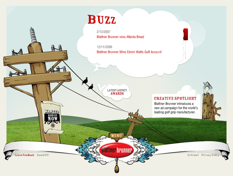
The 1st one is Blattner Brunner, which is a professional advertising company. What I like from this kind of website is the cartoon style and its gorgeous graphics. Actually, that's what we're going to deliver to our audiences: some animations in the background, clear, eye-catching and united design graphics, as well as an evident purpose of the website. 2ndly, the sound effects are really suitable for this kind of style and somehow funny, so the audiences always feel interesting when visiting the site. In my opinion, it's always especially good to combine sound with visual cues and whenever the users click on a button or something, they will feel more involved in the site and want to explore more about the site.

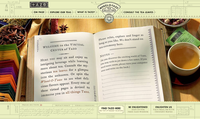
The next one is the homepage of Tazo Tea. I like the strong and outstanding combination between the drawing part and the images, which helps design a relevant style of tea in general. Like the Blattner Brunner, this website also makes a strong use of sounds and music for the navigation. The sounds of various instruments create a traditional mood for the whole website. The icon for loading page is a tea pot which gets involved clearly and closely to the main goal of the site. I think the site is influenced by Asian style, in which the tea mainly comes from; so it can reach a great amount of audiences and may gain some successful achievements in this kind of commercial websites.

My opinions for our Ack Ack websites:
- We need some humorous animations in the background to make it more real and enjoyable.
- It should be explorable as well as informative, because our characters are new to the market, so the information about who/when/where/why is very neccessary. In addition, once the target audiences like to interact with everything we put on the website, that's our success.
- The design must be clean, stable and suitable to the main theme of the site.
- Some some effects or music are needed, which correlate with their meaning, to reinforce the information and visual elements.
The 1st one is Blattner Brunner, which is a professional advertising company. What I like from this kind of website is the cartoon style and its gorgeous graphics. Actually, that's what we're going to deliver to our audiences: some animations in the background, clear, eye-catching and united design graphics, as well as an evident purpose of the website. 2ndly, the sound effects are really suitable for this kind of style and somehow funny, so the audiences always feel interesting when visiting the site. In my opinion, it's always especially good to combine sound with visual cues and whenever the users click on a button or something, they will feel more involved in the site and want to explore more about the site.
The next one is the homepage of Tazo Tea. I like the strong and outstanding combination between the drawing part and the images, which helps design a relevant style of tea in general. Like the Blattner Brunner, this website also makes a strong use of sounds and music for the navigation. The sounds of various instruments create a traditional mood for the whole website. The icon for loading page is a tea pot which gets involved clearly and closely to the main goal of the site. I think the site is influenced by Asian style, in which the tea mainly comes from; so it can reach a great amount of audiences and may gain some successful achievements in this kind of commercial websites.
My opinions for our Ack Ack websites:
- We need some humorous animations in the background to make it more real and enjoyable.
- It should be explorable as well as informative, because our characters are new to the market, so the information about who/when/where/why is very neccessary. In addition, once the target audiences like to interact with everything we put on the website, that's our success.
- The design must be clean, stable and suitable to the main theme of the site.
- Some some effects or music are needed, which correlate with their meaning, to reinforce the information and visual elements.
Subscribe to:
Posts (Atom)
