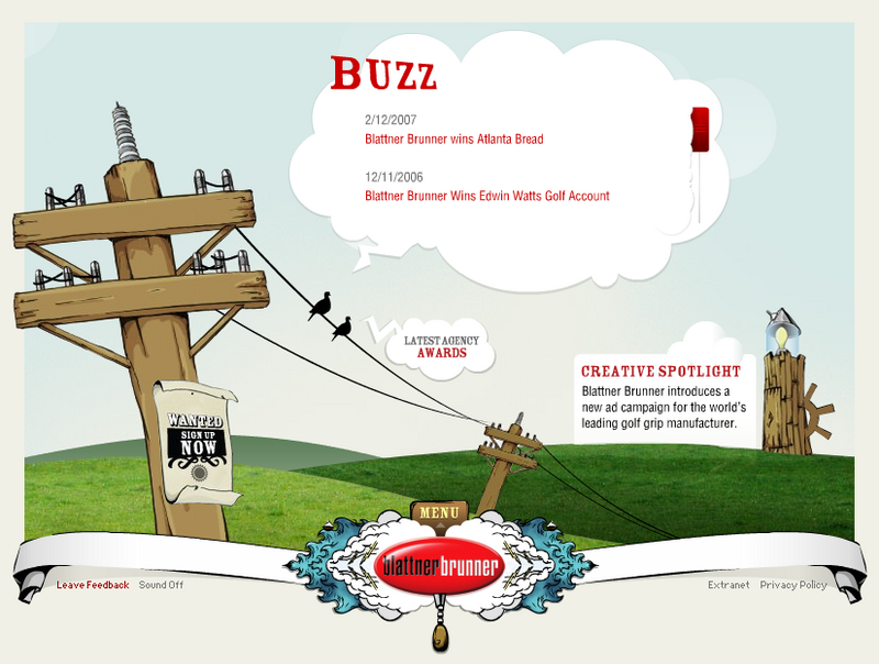
The 1st one is Blattner Brunner, which is a professional advertising company. What I like from this kind of website is the cartoon style and its gorgeous graphics. Actually, that's what we're going to deliver to our audiences: some animations in the background, clear, eye-catching and united design graphics, as well as an evident purpose of the website. 2ndly, the sound effects are really suitable for this kind of style and somehow funny, so the audiences always feel interesting when visiting the site. In my opinion, it's always especially good to combine sound with visual cues and whenever the users click on a button or something, they will feel more involved in the site and want to explore more about the site.
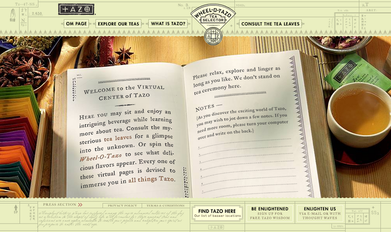
The next one is the homepage of Tazo Tea. I like the strong and outstanding combination between the drawing part and the images, which helps design a relevant style of tea in general. Like the Blattner Brunner, this website also makes a strong use of sounds and music for the navigation. The sounds of various instruments create a traditional mood for the whole website. The icon for loading page is a tea pot which gets involved clearly and closely to the main goal of the site. I think the site is influenced by Asian style, in which the tea mainly comes from; so it can reach a great amount of audiences and may gain some successful achievements in this kind of commercial websites.
My opinions for our Ack Ack websites:
- We need some humorous animations in the background to make it more real and enjoyable.
- It should be explorable as well as informative, because our characters are new to the market, so the information about who/when/where/why is very neccessary. In addition, once the target audiences like to interact with everything we put on the website, that's our success.
- The design must be clean, stable and suitable to the main theme of the site.
- Some some effects or music are needed, which correlate with their meaning, to reinforce the information and visual elements.